The Ultimate Guide For What to Wear for Family Photos
newborn
family
Client tips
parent tips

I'm Marjorie
LOS ANGELES NEWBORN & FAMILY PHOTOGRAPHER
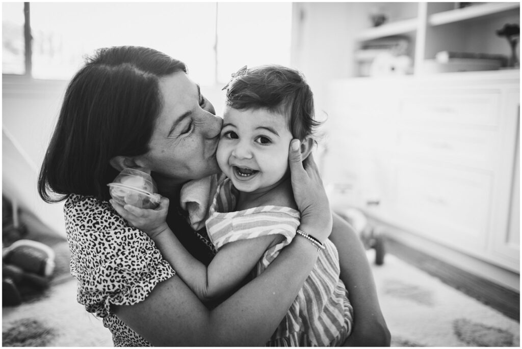
I work with parents who want relaxed and unposed photos, providing them with images that capture the joyful and unscripted moments in life.
More about Me
Wondering what to wear for family photos? Here is a comprehensive guide to help you get ready for your family photo session. Includes tips for each parent as well as your kiddos, with lots of photo examples of each!
As a documentary-style photographer, this guide is geared towards families who want relaxed and natural photos with their children so they can remember this moment in time.
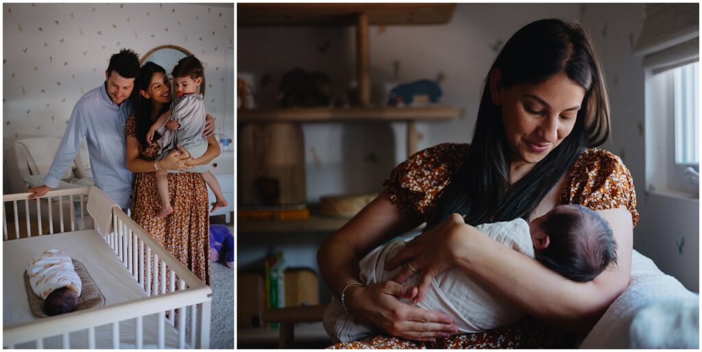
Table of Contents
Overall Style
Here are the three main things I suggest when it comes to choosing outfits for family photos:
- Keep it simple.
- Keep it you.
- Keep it comfortable.
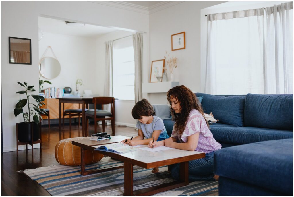
There’s no need to purchase new outfits for family photos. Select something from your closet that you’d throw on if you had some new friends coming over. Solid colors work great, especially when paired with varying textures or layers.
If you’re a jeans and a t-shirt kind of gal, perfect! If you’re into flowy dresses, then go with that. Wear whatever is going to feel comfortable while you play and interact with your kids.
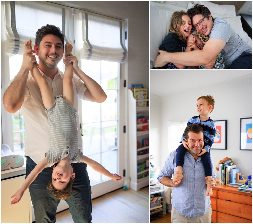
Make sure you and your partner can move around, sit on the the ground, lay in bed, and play with your kids. Avoid anything that’s too restrictive or that needs to be constantly adjusted.
Coordinate the level of dressiness or casualness as a family. If you’re in a dress, perhaps your partner can wear a button-up. If you’re in jeans and a t-shirt, your partner can wear a simple t-shirt that easily allows them to run around with the kids. Whatever the style is, make sure it’s consistent for all family members.
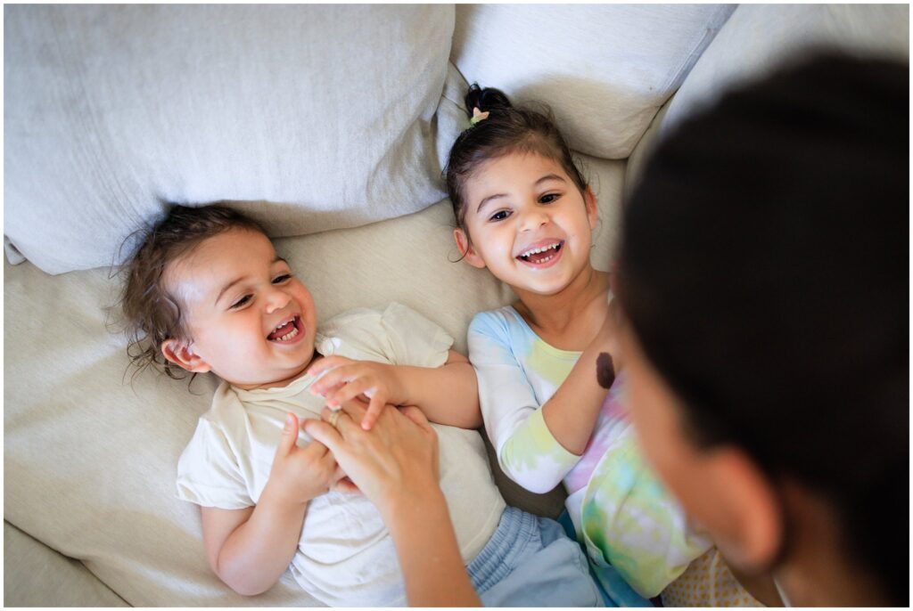
When it comes to picking outfits for your kids, make sure to involve them in the process. Especially if you have a strong-willed child! In fact, I would suggest pre-selecting 3 outfits for them and letting them pick their favorite. Give them some control so they remain happy and engaged during the photoshoot. Having a new person in their space can feel like a lot! Letting them dress themselves is an easy way to set them up for a successful photo session. For more on getting your child ready for photos, check out my article Preparing Your Child For A Photo Session.
Color Palette
When thinking about what to wear for family photos, color can play a big role. A great starting point is looking at your home decor. Do you have neutral or pastel colors, or bright and punchy tones? Your outfits for family photos should complement the tones and colors of your interior design.
Select outfits that work well with the colors you already have in your home to create a cohesive aesthetic in your photos.
If you’re unsure, go neutral. It’s hard to go wrong with solid colors, especially neutral ones such as off-white, beige, and gray.
Remember: the idea of outfits for family photos is to highlight YOU: Your family and the love and connection you share. The outfits are there to support that, not to shine on their own.
What *NOT* to wear for family photos
If you’re feeling unsure or overwhelmed when thinking about what to wear for family photos, I find that looking at a list of things to AVOID can make it easier. This will help point you in the right direction and understand what could become a distraction.
AVOID
- All black or all white clothing
- Distinct logos
- Busy patterns
- Large text
- Matchy-matchy
Ultimately, the goal is to avoid having any distractions. We don’t want anything to pull the eye away from your faces in the images. Not even your fabulous new romper.
An all-black outfit, for instance, will absorb light, causing us to lose details in the images. Typically, black is a flattering color, but if you wear all-black, you could blend into the background too easily.
All-white does the opposite. It reflects light in every direction and can create exposure challenges for the camera by blowing out your outfit, making it much brighter than everything else in the frame.
When it comes to text, it’s best to avoid it completely. The first thing we look for in photographs are faces. The second thing is — you guessed it — text. It’s our instinct to read any words in an image. That’s not something you want to draw attention to in your family photos.
Although there are photographers (and families) out there who lean towards the matchy-matchy look, I’m personally not a fan. When everyone is dressed the same, the outfits draw attention to themselves and take away from the connection between family members.
Finally, as much as punchy colors or intricate patterns can work to enhance your personality, we don’t want any one individual to stand out too much in the context of family photos. The idea is to capture your connection with each other. So it works best to have everyone on the same plane. Save the bold patterns for your branding photo session!
What should mom wear for family photos?
I cannot overstate the importance of picking an outfit that is comfortable. Of course you want to look great, but don’t sacrifice your comfort or mobility during your session. Wear something that is flattering and low-maintenance. It’s hard enough to feel comfortable in front of the camera. Don’t make it harder on yourself by choosing something that constantly needs to be adjusted.
Whether that looks like jeans and a t-shirt or a long, flowy dress, pick something that will make you feel good in your body. Feeling good is as important as looking good.
Solid colors with texture work great, as do simple patterns, like stripes or florals.
Remember to choose an outfit that allows you to comfortably sit on the ground, lay in bed, and play with your kids.
What should dad wear for family photos?
The key is for everyone to match in terms of how casual or dressy the outfits are. If mom (or parent A) is in jeans and a t-shirt, then dad (or parent B) should wear something similar. Alternatively, if mom is in a flowy dress, then dad might be in a button-up and slacks.
Layers work great to make simple shirts a little more dynamic. Button-ups can work well as long as the fabric is not too stiff.
Typically – and this is a big generalization – dads tend to be more playful and active during a photo session. Make sure dad’s outfit allows for movement and feels comfortable. Avoid anything restrictive. Remember: everyone will likely get asked to sit on the ground, lie in bed, and run around with the kids throughout a family photo session.
What should kids wear for family photos?
I personally love photographing toddlers getting dressed! If that’s something you and your photographer are open to, then make it part of your photo session.
As for selecting outfits for family photos, it’s important to match the tone so there is consistency between family members. If mom is in a casual outfit, then so should everyone else. If mom is in a flowy dress, then your kids can wear something a little more dressy.
Nothing is more important than making sure your child is happy and engaged during family photos. No perfect outfit will make up for a lack of joy or connection in your photos. I would suggest pre-selecting 3 outfits for them and letting them pick their favorite. Give them some control so they remain happy and engaged during the photoshoot. Letting them dress themselves is an easy way to make them feel involved and excited about getting photos.
For more on getting your child ready for photos, check out my article Preparing Your Child For A Photo Session.
4 Easy Tips for Choosing What To Wear For Family Photos
Here are 4 tips for keep in mind when selecting outfits for family photos–
Pick outfits that feel like you
Especially with documentary-style photography, you want your images to reflect a day in your life. Not the day the photographer came over. Pick something that you and your family members would actually wear, maybe even something that has meaning to you, so your photos really feel like you.
Make sure you’re comfortable
During your session, you’ll be playing with your kids, sitting on the ground, moving around, etc. Make sure your outfit is actually comfortable, and not just visually appealing. The same goes for the kids and your partner. Avoid anything restrictive or that you’re too precious about.
Create a cohesive look for all family members
Remember that the point of the photos is to capture all of you together – your connection, your dynamic, and your relationships with each other. If one person’s outfit is too flashy, it could take away from the whole. So do a quick visual check to make sure everyone’s outfits kind of go together.
Consider the decor of your home
If you’re having an at-home session, your interior design is going to play a role in the aesthetic of your photos. Make note of the colors you see in the areas you’d like to take photos, and make sure they work with the outfits you’re wearing.
Examples of Family Photo Session Outfits
Here are some examples of outfits that worked great for family photos! I’ll walk you through each of them and tell you why I think they worked.
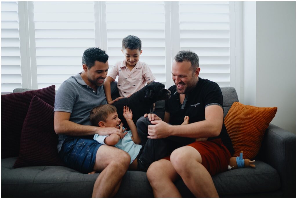
Solid colors and off-white
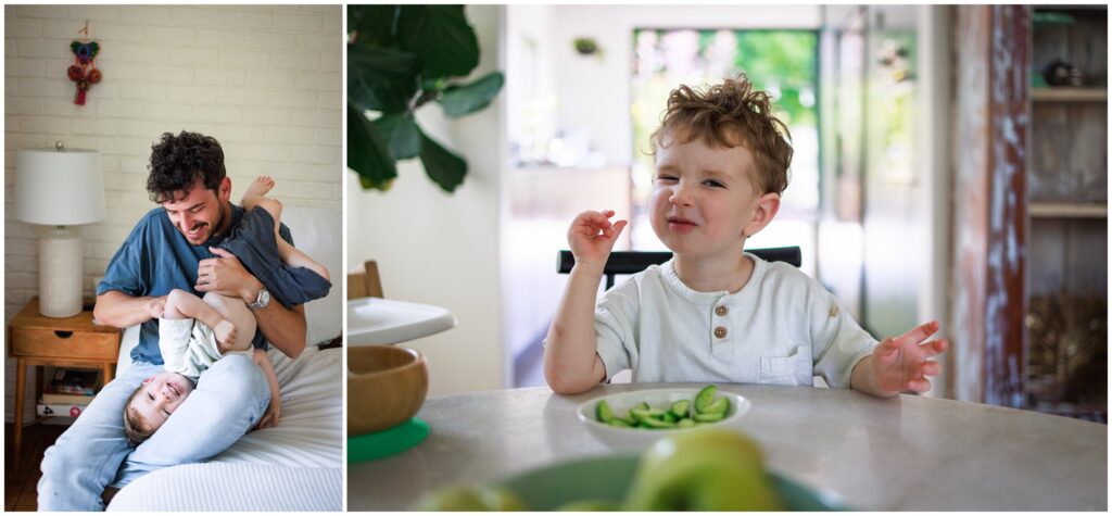
This family wore mostly solid colors that were slightly muted, so the overall palette works well together and the eye is drawn to their faces in the photo. But choosing an off-white, textured t-shirt for their toddler, it adds a layer of interest without becoming distracting.
Small pattern and complementary colors
This mom went with an orange patterned dress. It works because the pattern is small and therefore, not distracting, and has a muted color that complements the other colors in her home.
One bolder color with a complementary color
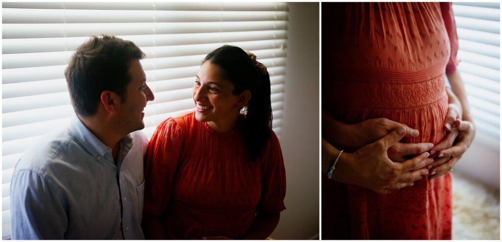
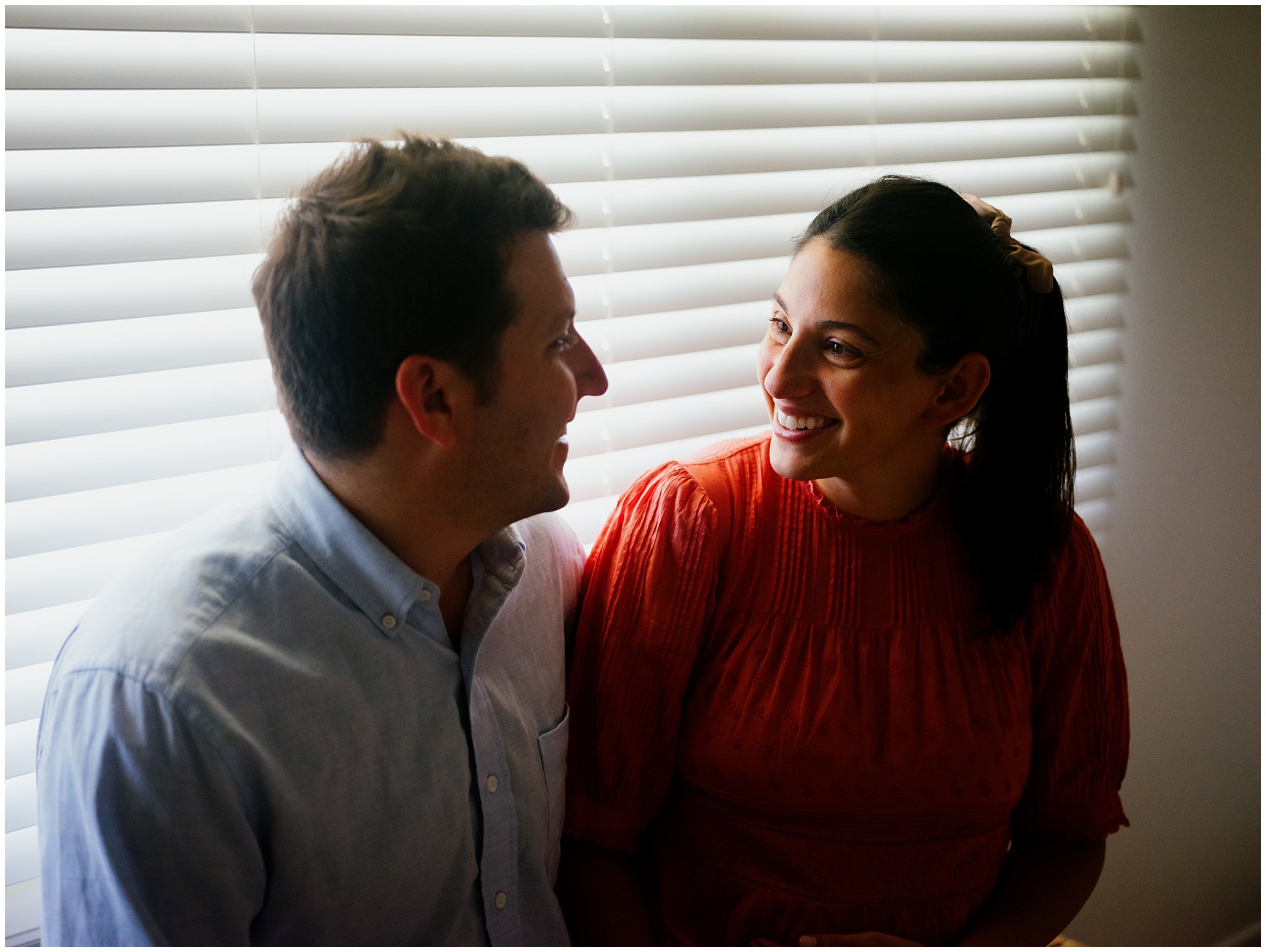
Although, generally speaking, I recommend avoiding bright colors, in this case we were doing some maternity-style photos after this couple’s toddler went down for a nap. Since it was just the two of them, mom wore this orange outfit and dad kept his pale blue shirt. The colors complement each other, and the dress works harmoniously with mom’s skin tones. It was a great outfit to bring more attention to mom and baby-to-be.
Still Looking To Hire A Los Angeles Family Photographer?
If you’re local to Los Angeles and looking for a family photographer, visit my website to learn more about what it would be like to work with me! Or contact me for a free 10-minute, no commitment call! I look forward to hearing from you!
What To Wear For Family Photos
Marjorie Cohen is a Los Angeles Family Photographer offering at-home documentary sessions to families in LA County. Marjorie works with parents who want relaxed and natural photos with their kids. Follow along in Instagram and Pinterest for her latest work!
Preparing Your Home For Your Photo Session
Easy and stress-free guide on getting your home ready for a photo session. Here’s what you need to do and here’s what you can skip!
5 Quick Tips for
grab your guide


free guide


Post Comments